This is an example of how we worked with the owner from product development to store production. Starting with a survey of sweets stores in the Tokyo metropolitan and Kansai areas, we considered what kind of uniqueness the brand should have. We considered the genre of finger sweets, and developed a brand that would allow people of all ages and both genders to enjoy sweets in a casual manner.
商品の開発から店舗のプロデュースまでオーナーと一緒になって作り上げた事例。首都圏・関西圏のスイーツショップの調査から初め、どのような独自性をもったブランドにするかを検討。フィンガースイーツというジャンルを考え、年齢や性別問わずスイーツを気軽に楽しんでもらえるブランドを開発した。
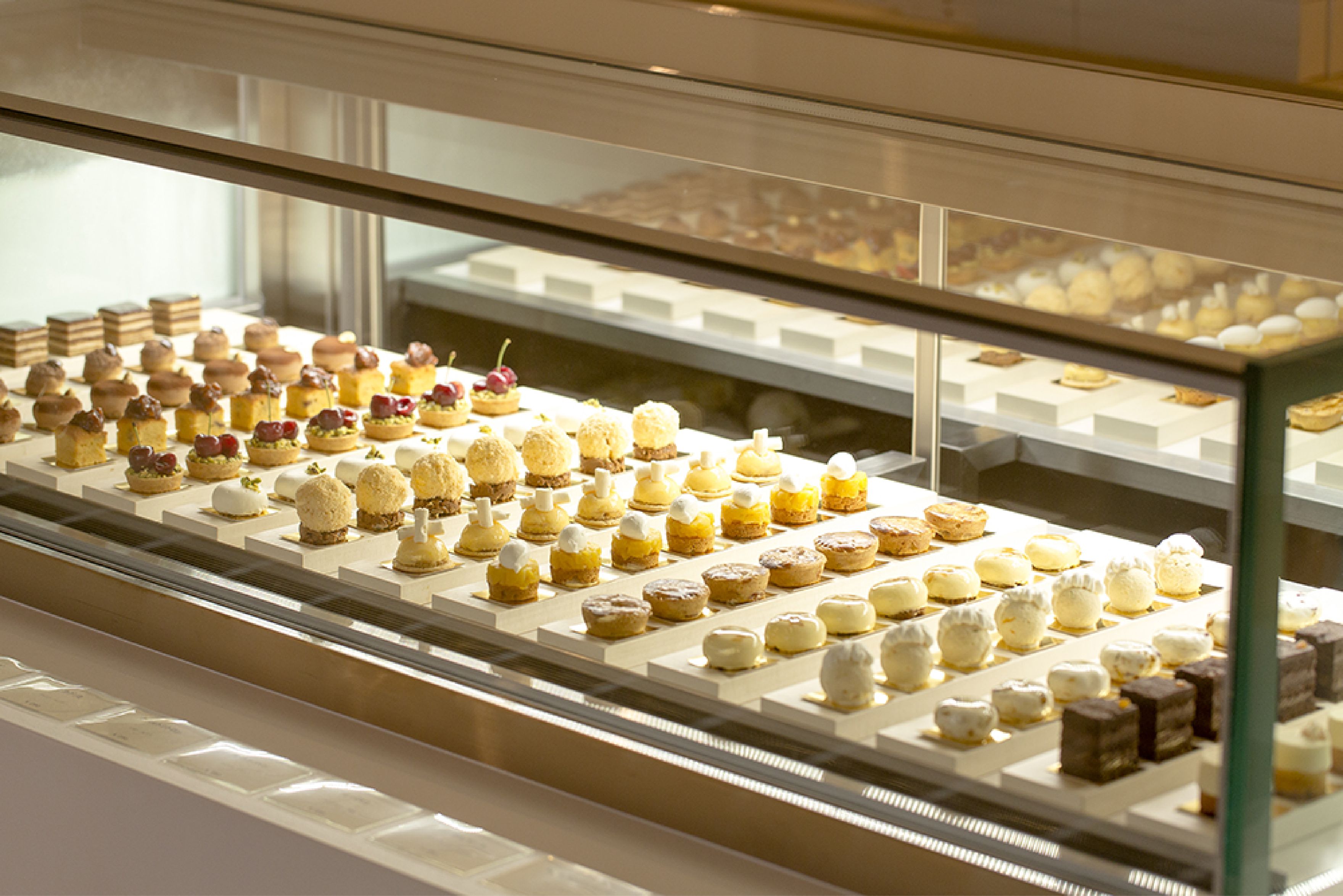
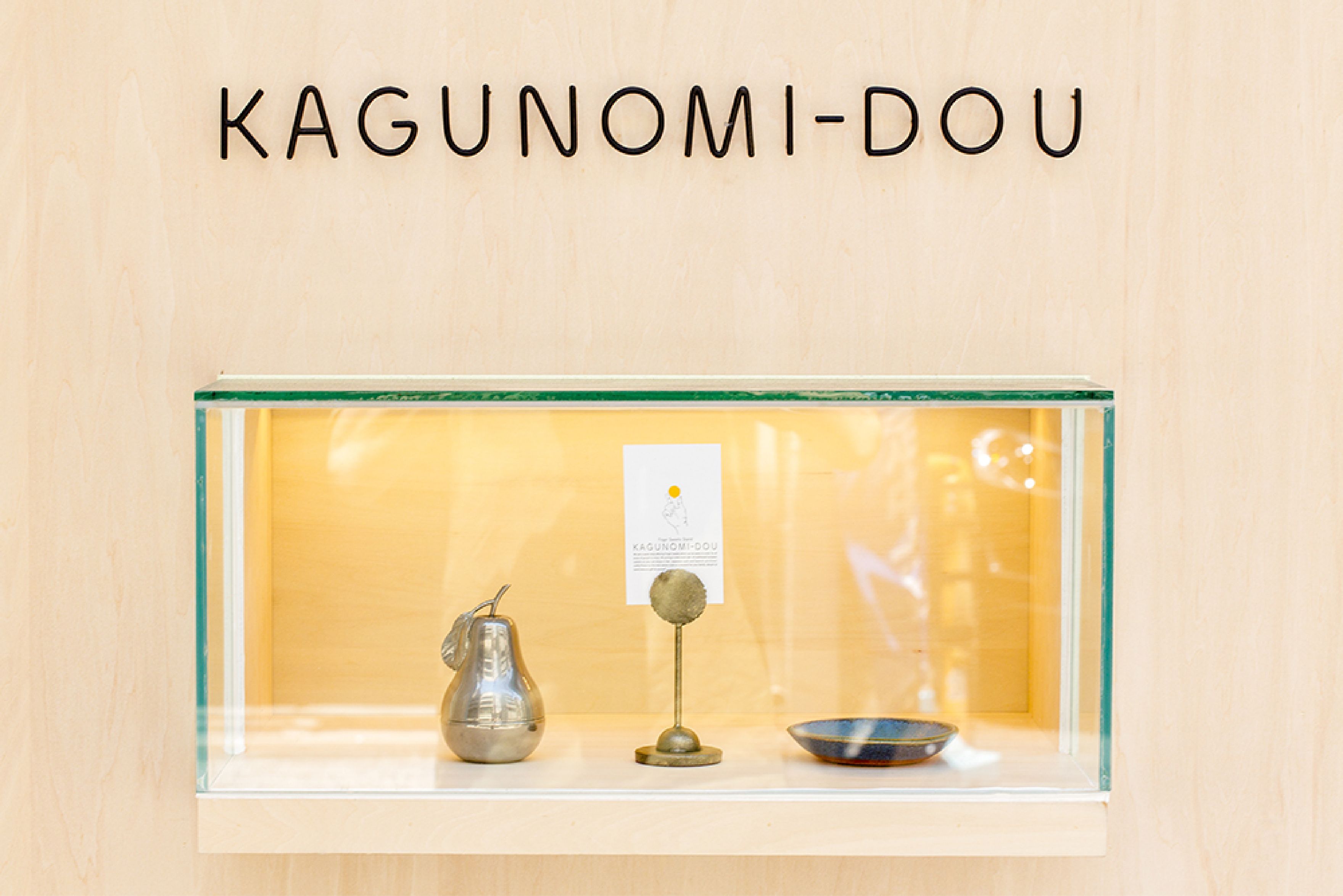
The VI was developed so that the concept of finger sweets, which symbolizes the characteristics of the brand, would be immediately recognizable, and the application was designed to encourage users to spontaneously transmit information, with an image that would be imitated and uploaded on the SNS and other sites. The design was also intended to encourage users to spontaneously send out information.
ブランドの特徴を象徴するフィンガースイーツというコンセプトがすぐにわかるようにVIを開発しアプリケーションの展開もデザインした。SNSなどでも真似してアップしてもらえるようにというイメージも持ちながらユーザーが自発的に情報発信してくれるようなデザインを採用した。
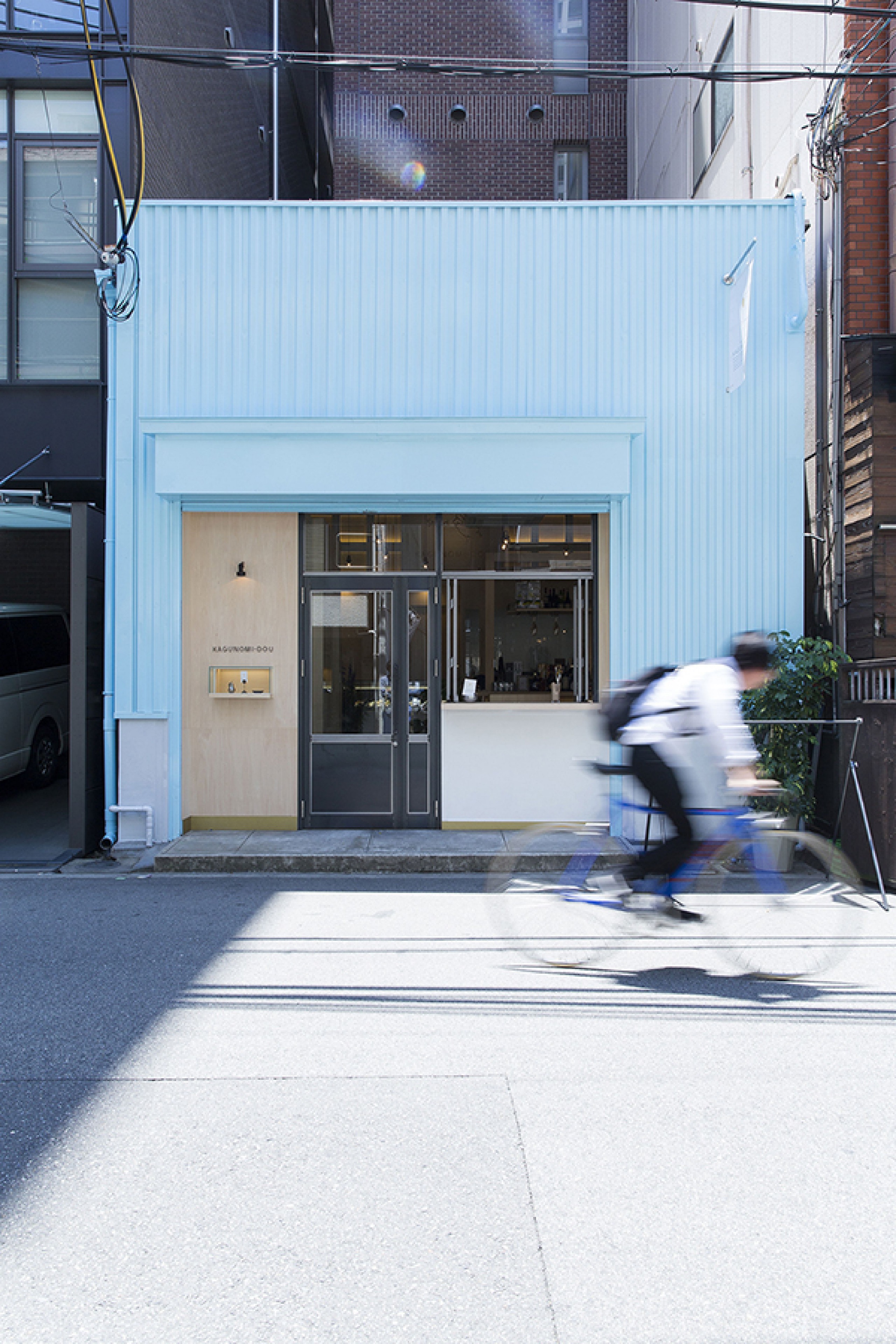
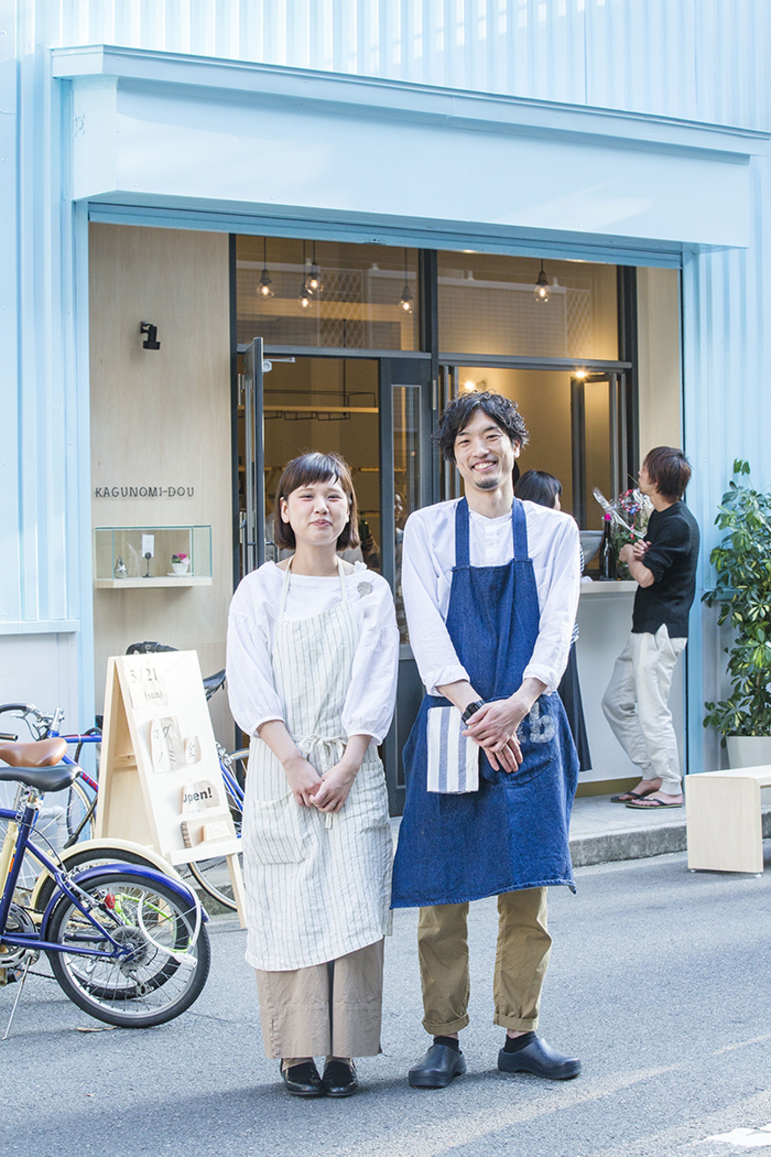
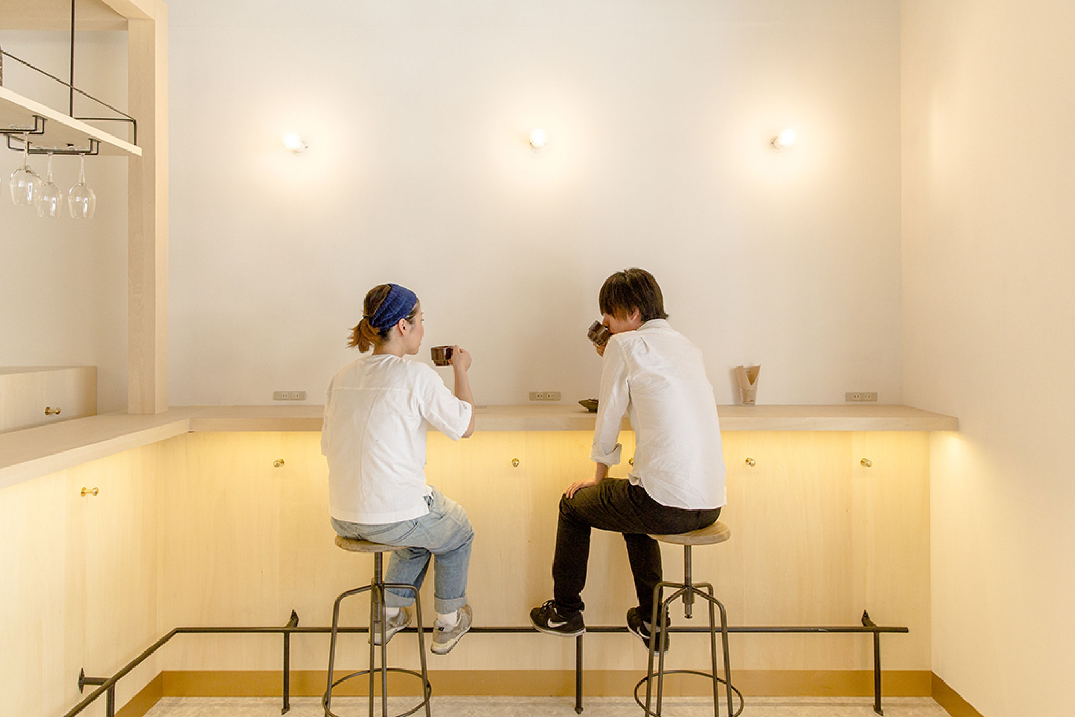
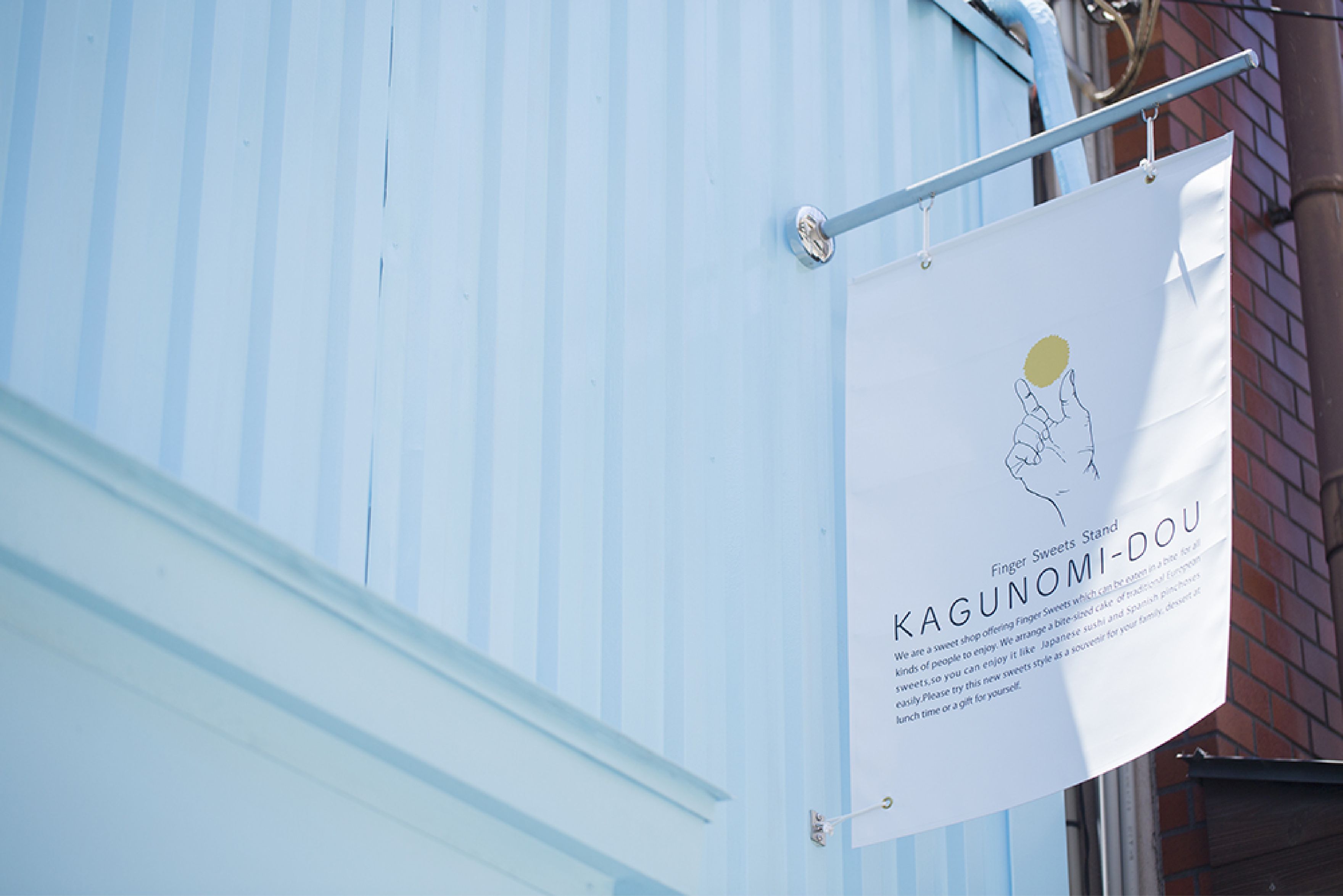
The store was designed to look like a bar where people can casually drop in for a casual meal, and light blue, a color not usually used for eating and drinking, was used as the store's color to create an impact and make the store memorable. Currently, the store operates as a popular sweets store in Osaka, and has begun to expand out of Osaka to other cities in the region.
店舗に関しても気軽にカジュアルに立ち寄れるバルのようなスタイルをイメージ、普通はあまり飲食に使わない色彩である水色を店舗のカラーとしてインパクトをつけることで印象的になり、来た人に覚えてもらえるようなお店づくりを心がけた。現在は大阪のスイーツの人気店として運営、さらに大阪を飛び出し地方の都市への展開を始めている。
CREDITS
- Client:
- Kagunomi-dou / かぐのみ堂
- Web Site:
- https://www.kagunomi-dou.jp/
- Creative Direction , Design:
- Daisuke Orio